05Case Study
SALON WEBSITE
A beauty brand identity and digital experience inspired by transformation, femininity, and renewal. The project combines a custom lotus-inspired logo, a vibrant botanical color palette, editorial beauty imagery, and a responsive website designed to showcase salon services and encourage appointment bookings.
Services
- Brand Identity
- Logo Design
- Art Direction
- Website Design
- Responsive Web Design
01Brand Identity
Rooted in renewal.
A floral silhouette, a feminine profile, and flowing hair come together in the logo. Botanical pink and green carry the identity through the website, balanced by warm gold and cream.
Website color palette
- Pink
- #DF035F
- Green
- #1E5929
- Gold
- #E2A980
- Cream
- #FAEBE6
- Forest
- #243720
- Dark
- #131D03
02Art Direction
Beauty in full bloom.
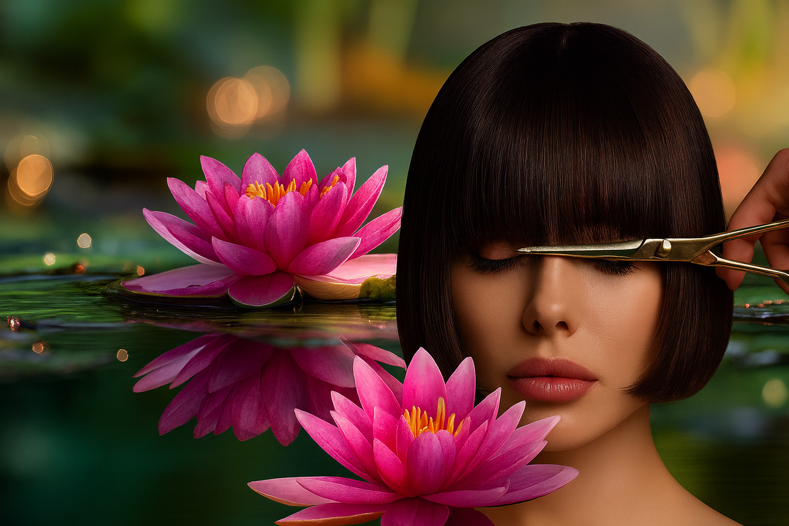
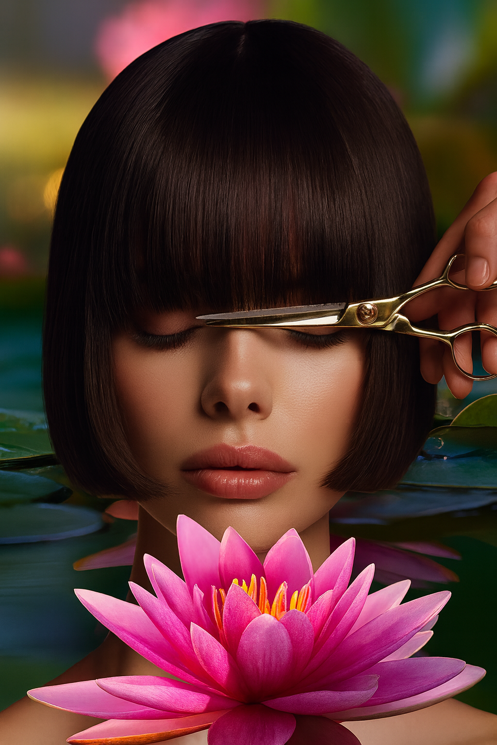
The precision of a haircut meets the softness of botanical imagery. Separate landscape and portrait compositions bring the same visual language to desktop and mobile without forcing one crop to do both jobs.
03Website Design
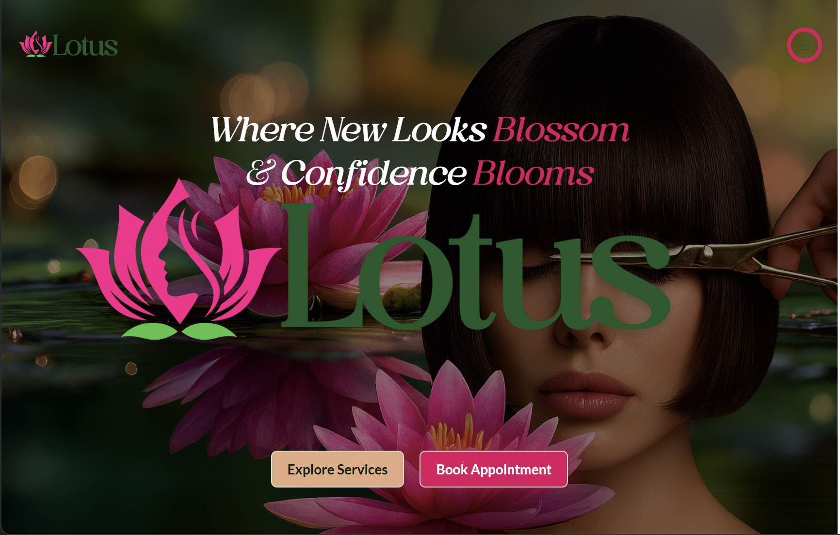
An identity, fully expressed.
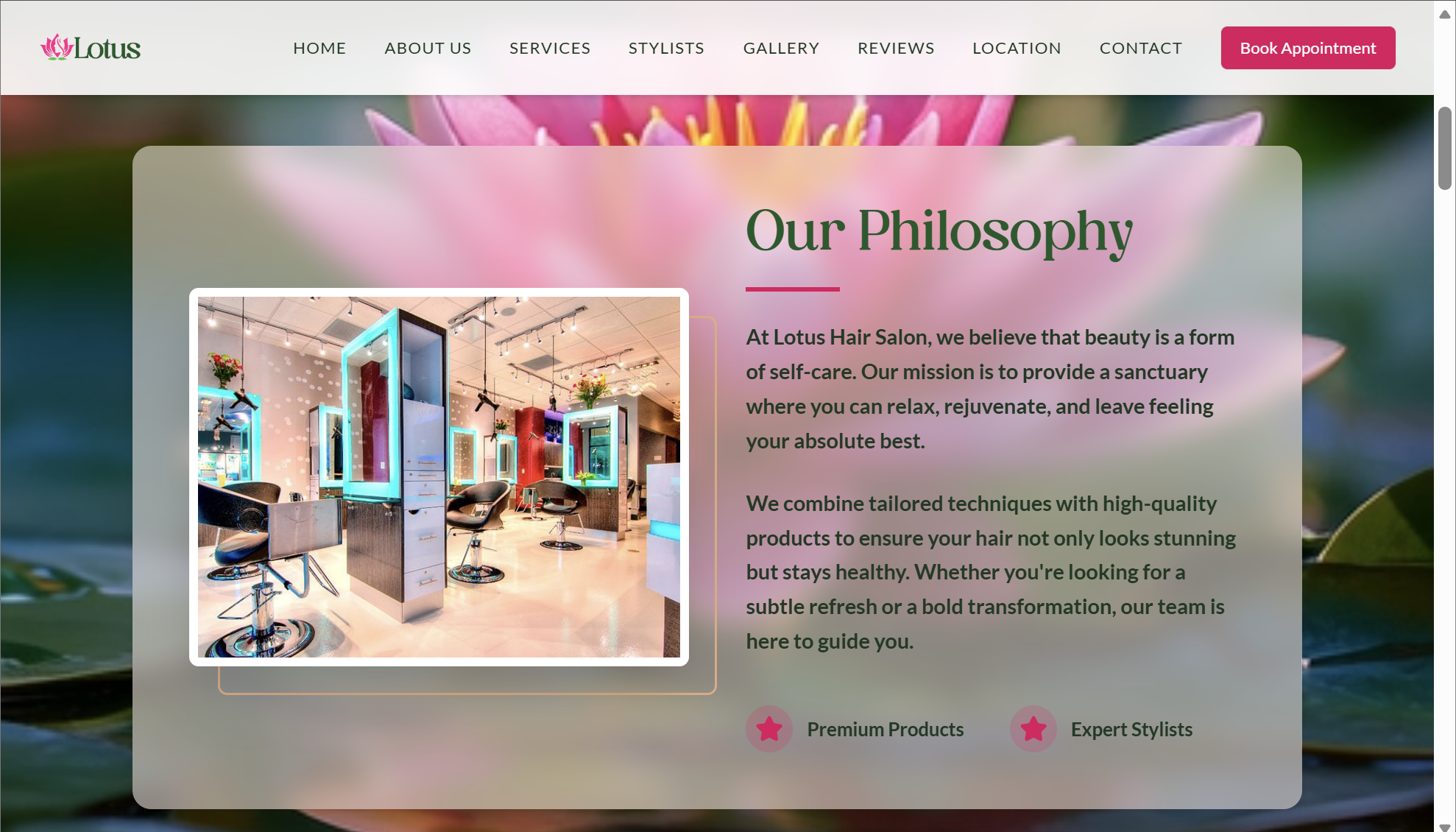
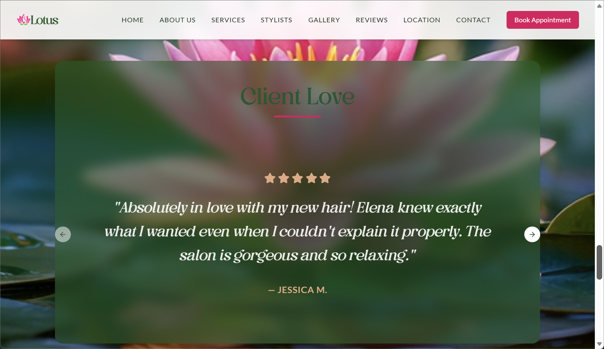
The website pairs bold brand imagery with service discovery and appointment prompts. These supplied screenshots document the homepage, philosophy section, and review presentation as designed.
04Motion
A living backdrop.
The original botanical film carries the floral art direction into motion. Presented here at its native portrait proportion, it adds atmosphere without competing with the content.
A short, silent loop of a pink flower on water, used as the website background.
Motion is paused to respect your reduced-motion preference.